


NB: Originally published on UXPAMagazine.org, Sep 2017 edition and available on jpang.io. Layout adapted for UX purposes.
Great UX is data-driven. The data itself is usually seen as numeric quantitative data,
but in many contexts, that’s not a sufficient descriptor.
Let’s take online shopping as an example. We browse online for the best prices, visit
retail stores for comparison and may end up purchasing in-store or even a
completely different item. However, we are usually left with a lingering retargeted
ad on Facebook based on your browsing history.
Perhaps seeing the item repeatedly convinced you to purchase the item, but were
the ads truly relevant or did it just become intrusive? My point is, the data-driven
design we experience today is typically A/B testing and algorithmic re-targeting, and
I believe it’s beyond that.
If you do an online search for “data-driven design,” you will receive a flood of results
about A/B testing and programmatic ad placements. It makes sense; data-driven
design conforms to users’ preferences, goals, and behaviors. The emphasis is usually
on A/B testing and programmatic ad placements, which are based on user behavior
– quantitative data insights.
If you A/B test two different call-to-action designs on a website, you may see a
drastic difference in receptiveness. But surely there must be more that’s responsible
for conversion than a beautifully designed button or eloquent copywriting.
A/B testing is a great means to gauge optimization and indicate user preferences,
but pinpointing users’ wants requires more depth. A well-orchestrated user
experience utilizes both qualitative (qual) and quantitative (quant) data insights (see
Figure 1) to bring about relevancy… with a dash of surprise.
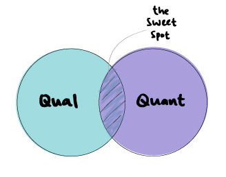
Figure 1. Effective data-driven design lives in the sweet spot of combined quantitative
and qualitative data.
Where UX meets hospitality
My educational background is rooted in the hospitality field, where everything is
centered around the Guest. This is similar to the User in UX, and it has been the
guiding principle in my design work.
I once waitressed at a restaurant that served finger foods, but no damp paper towels
were provided for the aftermath. The staff workaround was to wet napkins with
water, but that’s not an efficient nor sustainable solution. I later realized this was an
example of where quantitative data alone would not have alerted me to the issue.
Direct guest interaction (user feedback) indicated a need – a qualitative data point.
I had no idea what “user experience” meant at the time, but I knew what good
hospitality was. And now it all made sense: Everything is designed around the guest or
the user. What defines great hospitality is the human touch, the element of
empathy – those qualitative data insights.
Hotels have been tracking guest behavior for decades, based on
quantitative analysis of their travel choices, including room type, amenity, dining
and travel patterns. Combined with qualitative data such as user feedback, all these
data points allow us to understand user motivation and thus provide the best and
most relevant offers. Successful UX should adopt a similar approach in the context of
user journeys – through consistency and contextual relevancy.
Consistency: Consistency cultivates trust. The hospitality industry is all about
consistency, including the check-in experience, tone of voice in communication, and
housekeeping standards. Great UX keeps each touch point consistent.
Contextual relevancy: Putting things in a context users relate to builds relevancy. For
example, drawing parallels about a neighborhood for a first-timer in a new city, such
as, “it’s like SoHo in New York,” can quickly provide perspective. Similarly, effective
UX recommends the relevant product or experience to the user at the right time.
The landscape of data
Quant data is based on behavioral transactions and their frequency. Thanks to
advances in data science and AI, we can deep-dive these behaviors and predict the
propensity of users behaving a certain way.
The good thing about quant data is that they are easy to retrieve and analyse. In the
online travel industry, for example, there are all sorts of metrics at your fingertips
that can help predict a user’s likeliness to convert, including search behavior, hotel
or flight booking frequency and brand preferences. The key is to extract the relevant
ones and utilize them as features when communicating to the user.
I’ve had the opportunity to work with several talented data scientists who used
machine learning algorithms to calculate the propensity of a user’s behavior. This
approach increases accuracy and relevancy. When defining propensity, it can be the
likelihood to convert, to book the same hotel again, to book a flight to a country with
similar characteristics or simply the likelihood to travel again the same time as last
year.
Qual data, on the other hand, is based on user motivation and typically acquired
from user research and focus group interviews. Such data sheds light on why people
do what they do, and uncovers patterns otherwise not indicated by numbers alone.
You can place a remotely statistical figure on what people agree or disagree with,
but extracting these insights are much more valuable.
Qual data is hard to measure and track, which is why some UX practitioners engage
user personas to cluster different groups based on similar behavior or
characteristics.
In order to provide contextual relevancy, I previously experimented with and the contextual relevancy, I previously experimented with an
engagement piece – a survey paired with interactive landing pages. It’s a great way
to collect qualitative data points about users.
The Gamification in UX
Gamification has its roots in user motivation and habits. In other words, it’s a
system of game elements that keep users hooked, which is a great sign to being a
successful brand. When users get hooked, they are hooked to the rewards and find
value in your product or service offering. Adherence to the reward system is a
behavior wired in our brains and universal to any culture. It’s a universal human
motivation and want.
I launched a campaign called #TravelGoals to experiment with gamification. I learned
that not only does this method serve as a great framework, but its fundamental
principles in user motivations are universal, regardless of cultural differences.
The idea of #TravelGoals (see Figure 2) was to help users attain their travel goal by
keeping track of their progress, recommend offers to fast track their success, and
eventually celebrate their moment of triumph. For a travel loyalty program, this
builds contextual relevancy for the user by earning sufficient miles to reach their
goal – redeem a free flight.
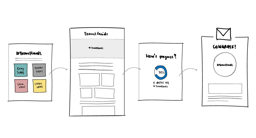
Figure 2. The idea of gamifying #TravelGoals was to help users attain their travel
goal by keeping track of their progress. The experience: Set your travel goal, check
out a travel guide. Track the progress of collecting travel miles. Celebrate your win in
the end!
Localizing a viral favorite
I love to time marketing campaigns with viral content because, as mentioned earlier,
relevancy is key to make users feel connected to your brand and to bring about
engagement. In Hong Kong, I redesigned a user acquisition campaign for a product
offering. The engagement piece, called “What’s Your HK Story?”, was equivalent to
viral Buzzfeed surveys such as “What’s your Star Wars character?”
Just like the previous approach, I used existing quant data to get a sense of the user
profiles and based on that communicated with an engagement piece to further
understand users’ likes and preferences. Finally, I followed up with a final offer
based on their profiles and survey answers. In order to make it more contextually
relevant, I adapted the survey to include elements of local Hong Kong user lifestyles
and cultural contexts (see Figures 3).
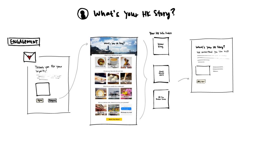
Figure 3. “What’s Your Hong Kong Story?” began with an email to spark
engagement, followed by a Buzzfeed-type quiz to gather preference data. The quiz
includes images of drinks, food, and experiences in Hong Kong. A “Hong Kong
Lifestyle Index” was generated, which determined what offer email was delivered.
The Pitfalls of Quant Data
Going back to the example of online shopping, I’ll use a personal story to illustrate
how using quant data alone may result in missed opportunities.
When online shopping, I typically go through the below shopping journey (see Figure
4):
1 & 2: Browse sites to look for a dress. 3: A cookie tracks my behavior 4. A retargeted
ad shows up via email and on Facebook. 5. Make a decision and buy dress
in-store instead. 6. The same re-targeted ad is still there.
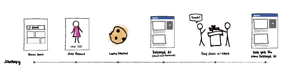
Figure 4: The online shopping journey to buy a dress includes browsing sites to look
for a dress, then a cookie tracks my behavior and a re-targeted ad shows up via email
and on Facebook. A decision is made and the dress is purchased in-store instead.
However, the same re-targeted ad is still there.
As you can see, the interaction from online browsing to offline purchasing is a
broken process and we have no visibility over it. From the user’s perspective, I only
found the re-targeted ads intrusive and redundant.
Instead, if the system had been set up to track my behavior in the right way (see
Figure 5), my re-targeted ad after conversion may well have been a pairing
suggestion. That, to me, is more valuable.
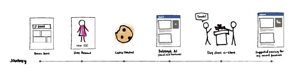
Figure 5. A more effective online shopping journey to buy a dress includes 1 & 2.
Browsing sites to look for a dress, 3. then a cookie gets tracked on the back end and
4. a re-targeted ad shows up via email and on Facebook. 5. A decision is made and
the dress is purchased in a store. 6. In this case, a suggested pairing for the recent
purchase is shown instead.
Data-driven design is a very creative space. Don’t limit yourself to just A/B testing
and programmatic ad placements. They should serve to increase awareness and
exposure but not used as conversion tools alone. It’s important to keep
experimenting with both quant and qual data inputs.
Remember: the core of all is user wants.
© UXPA, (2017). Reprinted from User Experience Magazine, {17, 4, (September 2017)} http://uxpamagazine.org/diversify-the-data-in-data-driven-design/


